Tuesday, 23 October 2012
Brief
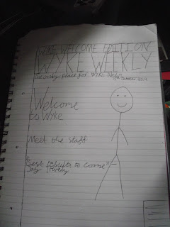
To design a front cover, contents and double page spread of a new music magazine. All images and text used must be original, a minimum of four images must be used.
Monday, 15 October 2012
Evaluation
I started
out by looking at conventions of different magazines and identified that the
most used conventions are; the masthead, the Skyline, the main cover line, the
selling line, barcode, the cover lines and the main image. Taking from my
research, I decided to use these conventions on my college magazine.
In my
planning I suggested that my model should be a student who is smiling and
holding a folder/has a bag, I used this because this is the classic stereotype
for a modern day student so when looking for my model I followed these classifications.
My audience
would be anyone who is looking to join or already has joined Wyke College and
wants to know more knowledge about the college/staff.
To appeal to
my audience I used a model that fits into the same age group and using the word
‘welcome’ makes the reader feel like the college is happy to have them there.
During my research I took out a survey to find out what people would like to
see from a college magazine.
I took my
photos of my model using my camera and loaded the best one on to Photoshop,
using Photoshop I resized the image by using the ‘Ctrl+T’ shortcut. I then used
the text tool to put the masthead, skyline, selling line, date line, and main
cover line and cover lines. I then took a barcode from Google images and placed
it onto my cover. The text was difficult to
see on top of my image so using the
blending options I used drop shadow to make my text easy to see over my image.
L – The image is a MLS of a student with direct mode of address. She is
stood against a locker holding a folder which connotes that she is a student at
Wyke College and is ready of a day of learning. Most magazines use a model with
direct mode of address which inspired me to do the same on mine. I used the
standard conventions of a masthead, skyline, selling line, date line, main
cover line, cover lines and a barcode to make my magazine look realistic and
make it actually look like a magazine and not a newspaper or poster. I used the
college’s colour scheme to connote that this magazine belongs and is about the
college. I repeated the name of the
college over and over again to show that the magazine is about the college. My
skyline shows that this issue is a special edition issue and shows it’ll talk
to people who have just joined/want to join the college.
I - I made
this myself so it would be a small company and would only branch out to
students/staff of this college or people considering joining the college.
I - The
ideology of my magazine is to promote the college to people who want to join
and for the people who have just joined to learn more about the college.
A - The
audience is anyone who is looking to join/has already joined the college.
R – The
model is represented as a student, she is stood within the college next to the
lockers, holding a folder, these are stereotypical things you would see a
student doing which connotes the ideology of the magazine.
Sunday, 14 October 2012
Examples of college magazines
These examples of college magazines all include a medium long shot of the model with direct mode of address with the model's head going over the masthead which both include the word 'College' in bold upper case text.
Saturday, 13 October 2012
Contents page analysis/LIIAR
L: Language completed in image.
I: The institution is Kerrang!. Kerrang! paid for Tay Jardine, who is a large and successful artist, to be on their front cover which shows they are a big magazine and can afford to pay for big bands/artist to feature on their covers.
I: The magazine focuses on a rock/alternative/metal genre of music.
A: The target audience of the magazine is teenagers who are interested in rock/alternative/metal music.
R: The images saying "Pop punk's not dead" shows that the issue is going to include a pop punk theme for example the safety pins which is a great example of old school punk.
Tuesday, 9 October 2012
Front cover analysis/LIIAR
L: Language is completed on photo
I: The institution is Kerrang!. Kerrang! paid for You Me At Six, who are a large and successful band, to be on their front cover which shows they are a big magazine and can afford to pay for big bands to feature on their covers.
I: The magazine focuses on a rock/alternative/metal genre of music.
A: The target audience of the magazine is teenagers who are interested in rock/alternative/metal music.
R: The images on the magazine represent the genre of music because the bands make the said genres of music, they are also wearing dark colours which connote to the genre it represents. The masthead looks like it has cracks in it which could connote to the genre.
Subscribe to:
Comments (Atom)


